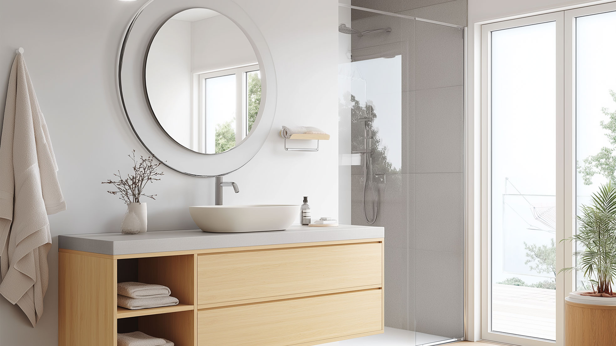
Imagine the following: you enter the bathroom early in the morning, still half asleep. The color of the walls, the light reflecting off the tiles, the accessories on the shelf, together they form your first impression of the day. What if those colors are not only aesthetic, but also influence your mood, energy and sense of calm?

Color psychology is not an abstract concept, but a scientifically substantiated approach that interior designers use to make spaces both visually appealing and emotionally supportive. Especially the bathroom, often compact but intensively used, is excellent for a conscious color choice.
White traditionally stands for purity, tranquility, and hygiene. It creates a fresh, spacious look and is ideal for smaller bathrooms. Psychologically, white evokes clarity and structure. However, a completely white space can quickly feel cold or clinical. Therefore, combine white with warm materials such as wood, rattan, or soft textiles in beige or sand tones to create a balanced, inviting atmosphere.
Blue is closely associated with water and air, elements that radiate calm and serenity. Lighter shades of blue evoke a relaxed spa feeling, while dark blue brings depth, elegance, and refinement. Blue has a calming effect and promotes confidence. By combining it with materials such as matte black, marble, or natural stone, a bathroom is created that is both soothing and full of character.
Green symbolizes balance, renewal, and rest. It brings nature indoors and has a refreshing, calming effect on body and mind. Shades like sea green, eucalyptus, or pine green create an organic atmosphere that invites slowing down and recovery. Combined with wood, plants, and natural stone, the bathroom takes on an almost therapeutic character, perfect for a wellness-like experience.
Grey stands for stability, neutrality, and refinement. It is a versatile color that can be both soft and powerful depending on the nuance. Light grey creates a serene, airy look, while dark grey adds more depth and luxury. Psychologically, grey radiates calm and objectivity. Work with matte surfaces, concrete look or natural stone for texture, and add warm elements such as wood or textiles for a balanced result.
Colors like terracotta, taupe, and sand bring a sense of security and comfort to the bathroom. These earthy tones evoke associations with safety and relaxation, exactly the qualities we seek in a personal care space. Consider a sand-colored wall, terracotta floor tiles, or accessories in taupe. Combine with wood, natural stone, and metal accents in gold or bronze to enhance a sense of luxury and warmth, as if you are stepping into a boutique spa.
Advice for a color-conscious bathroom
Conclusion
Color in the bathroom is much more than decoration. It's a powerful tool to bring together atmosphere, emotion, and functionality. By consciously choosing colors that match your life rhythm and needs, you transform the bathroom into a place of rest, recovery, and personal experience, a space where you not only start your day, but also truly come into your own.


